When you save an invitation photograph, it is easy to focus on its colour and miss how that colour was made. A gold detail might be printed ink or a foil finish. A deep impression might catch the light without adding any shine. Knowing which effect you like makes the conversation about your stationery much clearer.
Letterpress ink and hot foil are different processes, not simply two names for the same finish. Start with the result you want, then discuss the paper, artwork and production approach together.
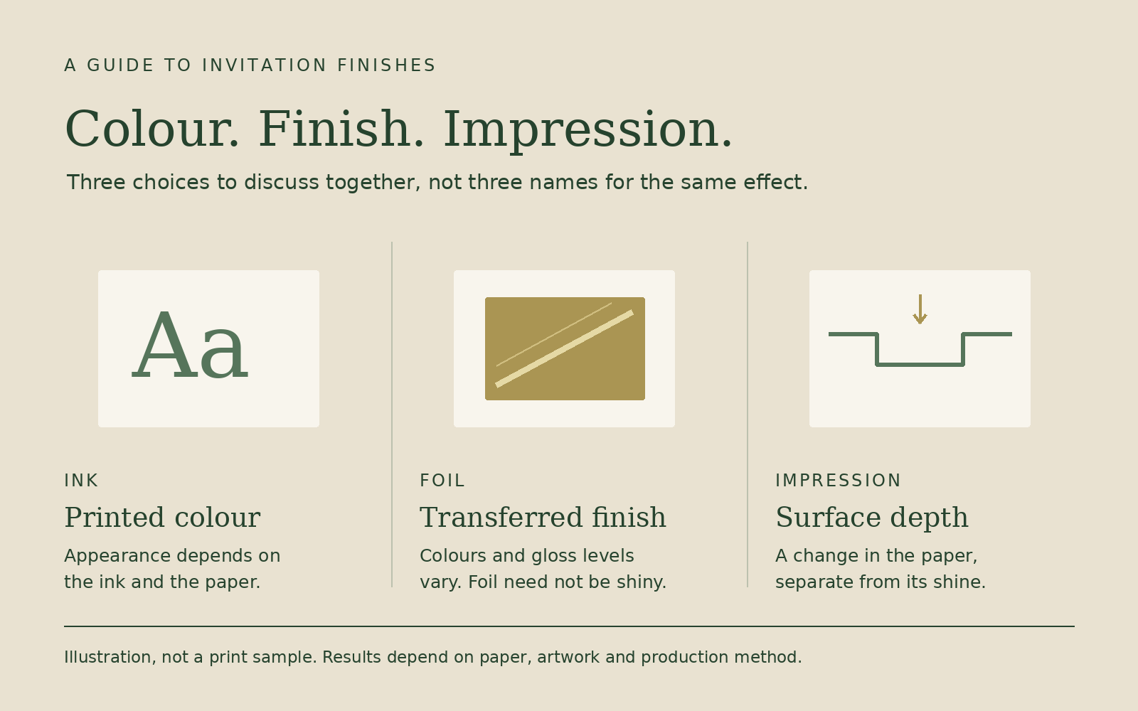
An illustrative guide, not a print sample. Paper, artwork and production method affect the finished result.
Look at the finish, not just the colour name
Inked letterpress printing uses ink rather than a transferred foil layer. Its appearance depends on the ink and the paper, so a colour on your screen is not the whole specification. On uncoated paper, a metallic ink can look much more subdued than a bright metallic foil. Boxcar Press describes the metallic inks it uses as producing a subtle glitter on uncoated stock, rather than a mirror-like surface.
Hot foil stamping transfers a decorative layer to the paper using a heated die and pressure. It is often associated with reflective gold and silver, but foil does not always mean shiny. Foil manufacturer KURZ also offers matte effects and different gloss levels.
The useful question is not simply “Can this be gold?” It is “Do I want a soft printed colour, a subtle metallic effect or a reflective accent?” Ask which options are suitable for the design and paper you are considering.
Treat colour and impression as separate decisions
An impression describes the change in the paper’s surface. Shine describes how the finish reflects light. One does not automatically tell you the other.
Avoid judging either from a single photograph. The lighting can make an impression appear stronger or a metallic detail look darker. Ask what the example actually uses, then compare relevant physical samples if they are available. Confirm what those samples demonstrate and what would still need to be assessed for your own artwork.
Paper also matters. Our guide to paper weight, thickness and letterpress samples explains why a gsm number alone does not describe the finished feel.
Check the details that need to stay readable
Names may be the visual focus, but a date, venue or RSVP address still needs to work at the finished size. Look closely at the smallest text, fine lines and any lettering placed within a larger coloured area.
If you prefer pale lettering on dark paper, raise that at the start. Do not assume that changing an ink colour will reproduce a white-on-black screen design. The paper can show through letterpress ink, so the printer needs to assess the intended contrast and suitable method.
Large areas and delicate details can also ask different things of a print process. Show the whole layout rather than choosing a finish from one isolated element. If you already have artwork, send the original PDF, if available, and tell us the finished invitation size. We can check whether fine lines and small lettering are suitable for foil at that size and flag anything that may need adjusting.
Compare the same design before comparing prices
When requesting alternatives, keep the invitation size, quantity, paper and number of printed sides clear. Identify exactly which elements would use each finish. Otherwise, two prices may describe different stationery rather than different ways of producing the same design.
For example, you might ask about ink for all the wording versus an alternative with a reflective detail on the names. That is a design comparison, not a standard package or a promise that either option suits every paper.
Ask whether the alternative changes artwork preparation, proofs or production timing. For weddings, our quote checklist helps you compare the full scope rather than the finish alone.
Bring a clear reference to your enquiry
Send a small selection of examples and explain what you like about each: its colour, reflected light, impression or spacing. Include your wording, quantity, preferred size, required delivery date and delivery postcode.
The Pressroom creates custom letterpress stationery in Ballarat for clients across Australia. Get in touch to discuss the result you want and the options suitable for your project.